ShopDreamUp AI ArtDreamUp
Deviation Actions


Suggested Deviants


Suggested Collections
![PMDU - sleeping zangoose [sketch]](https://images-wixmp-ed30a86b8c4ca887773594c2.wixmp.com/f/2132905b-d551-4cc0-8087-25303319dae0/d8plbpe-dcae8898-e943-4573-b3e9-ce1ff26a03bb.jpg/v1/crop/w_184,h_184,x_21,y_0,scl_0.10514285714286,q_70,strp/pmdu___sleeping_zangoose___sketch__by_leoguardian_d8plbpe-92s-2x.jpg?token=eyJ0eXAiOiJKV1QiLCJhbGciOiJIUzI1NiJ9.eyJzdWIiOiJ1cm46YXBwOjdlMGQxODg5ODIyNjQzNzNhNWYwZDQxNWVhMGQyNmUwIiwiaXNzIjoidXJuOmFwcDo3ZTBkMTg4OTgyMjY0MzczYTVmMGQ0MTVlYTBkMjZlMCIsIm9iaiI6W1t7ImhlaWdodCI6Ijw9NzAwIiwicGF0aCI6IlwvZlwvMjEzMjkwNWItZDU1MS00Y2MwLTgwODctMjUzMDMzMTlkYWUwXC9kOHBsYnBlLWRjYWU4ODk4LWU5NDMtNDU3My1iM2U5LWNlMWZmMjZhMDNiYi5qcGciLCJ3aWR0aCI6Ijw9MTAyNCJ9XV0sImF1ZCI6WyJ1cm46c2VydmljZTppbWFnZS5vcGVyYXRpb25zIl19.wMgLONIW3Pd8Gtt05EcQjD2E_fnTJa1vGXLCw5vxKsA)
![PMDU - sleeping zangoose [sketch]](https://images-wixmp-ed30a86b8c4ca887773594c2.wixmp.com/f/2132905b-d551-4cc0-8087-25303319dae0/d8plbpe-dcae8898-e943-4573-b3e9-ce1ff26a03bb.jpg/v1/crop/w_92,h_92,x_11,y_0,scl_0.052571428571429,q_70,strp/pmdu___sleeping_zangoose___sketch__by_leoguardian_d8plbpe-92s.jpg?token=eyJ0eXAiOiJKV1QiLCJhbGciOiJIUzI1NiJ9.eyJzdWIiOiJ1cm46YXBwOjdlMGQxODg5ODIyNjQzNzNhNWYwZDQxNWVhMGQyNmUwIiwiaXNzIjoidXJuOmFwcDo3ZTBkMTg4OTgyMjY0MzczYTVmMGQ0MTVlYTBkMjZlMCIsIm9iaiI6W1t7ImhlaWdodCI6Ijw9NzAwIiwicGF0aCI6IlwvZlwvMjEzMjkwNWItZDU1MS00Y2MwLTgwODctMjUzMDMzMTlkYWUwXC9kOHBsYnBlLWRjYWU4ODk4LWU5NDMtNDU3My1iM2U5LWNlMWZmMjZhMDNiYi5qcGciLCJ3aWR0aCI6Ijw9MTAyNCJ9XV0sImF1ZCI6WyJ1cm46c2VydmljZTppbWFnZS5vcGVyYXRpb25zIl19.wMgLONIW3Pd8Gtt05EcQjD2E_fnTJa1vGXLCw5vxKsA)


You Might Like…


Featured in Groups


Description
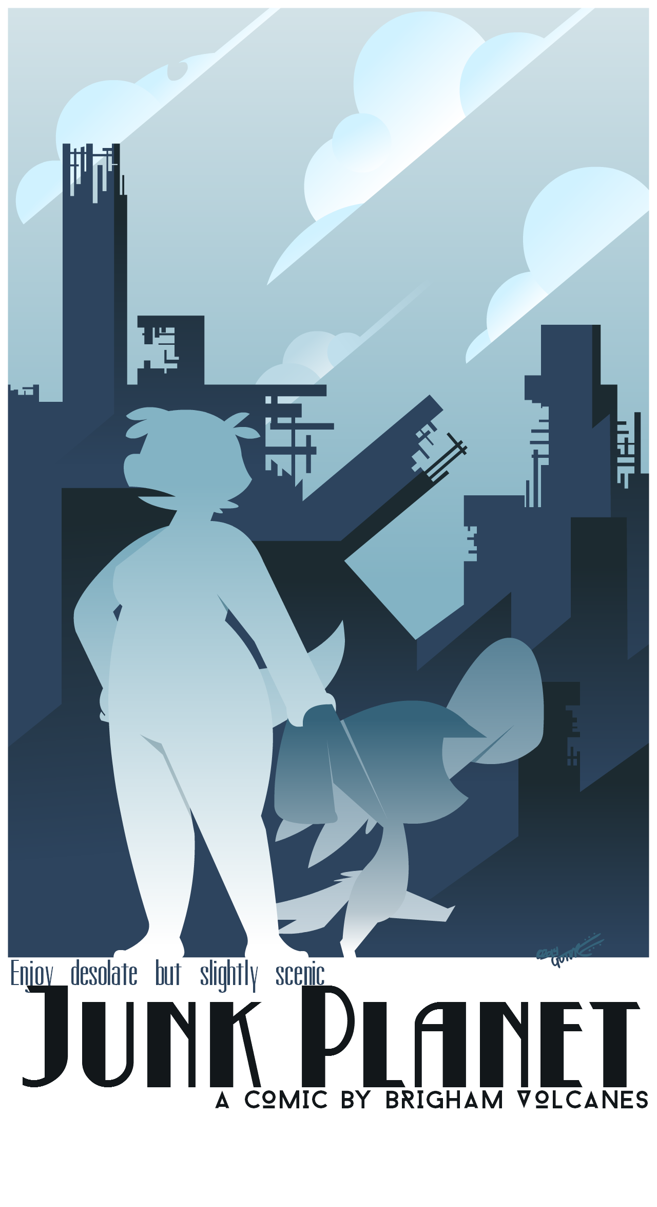
I was trying to make a 20's style poster.
Image size
1280x2349px 295.66 KB
© 2014 - 2024 PotooBrigham
Comments20
Join the community to add your comment. Already a deviant? Log In
It's a lovely piece and certainly captures the feel of the era. Good job on creating a limited palate that gives an impression of something less than sunny. The clouds also look very deco.
The previous critiquer mentioned the overlap on the "j" in "Junk Planet" with the letters above it. The problem is that all the lettering on this cramped. If that was intended, make it moreso. Otherwise, you want to make things as inviting as possible for the viewer.
Putting the one building at the same slant as the clouds doesn't work. It shows a semi-relation that doesn't go far enough if they are related -- why the same slant? Also, why are the clouds at the same slant? It looks like they're attacking the city. If all the buildings were going vertical witht the slanted clouds, it would create a sense of ominous foreboding. You need to create an overall mood and stay with it.
The weakest part of this is your two characters. Because they're not human and not as recognizible as, say, Mickey Mouse, the viewer has to make sense of them. And that's just difficult to do in this work. I didn't even realize it was two characters until I looked at your other works. I thought a dinosaur girl was putting a dark towel or blanket over some sort of bush behind her. You'd benefit by not using their silhouettes but maybe a monochrome version of them. They should also look like they're having more fun (fits the travel poster theme) or are very anti-fun (irony isn't dead, just overused to near-death) or have more of a contrast of one having fun and the other not (establish character).
Also, nice work on having a distinct signature that doesn't detract from the piece.
The final consideration, though, is how effective is this in getting people to read your comic. For me, the answer is that it piques my interest, but it doesn't really make me want to search out the comic (I did look a bit to see what it was about - make more of it and make it more accessible).
If you want to do more deco-style work, I suggest you got with DecoEchoes on here, who really has the style down but still manages to be original. He has something similar to this here: decoechoes.deviantart.com/art/…
But if I were you, I'd do more comics and less advertising until you have a large body of work to advertise.